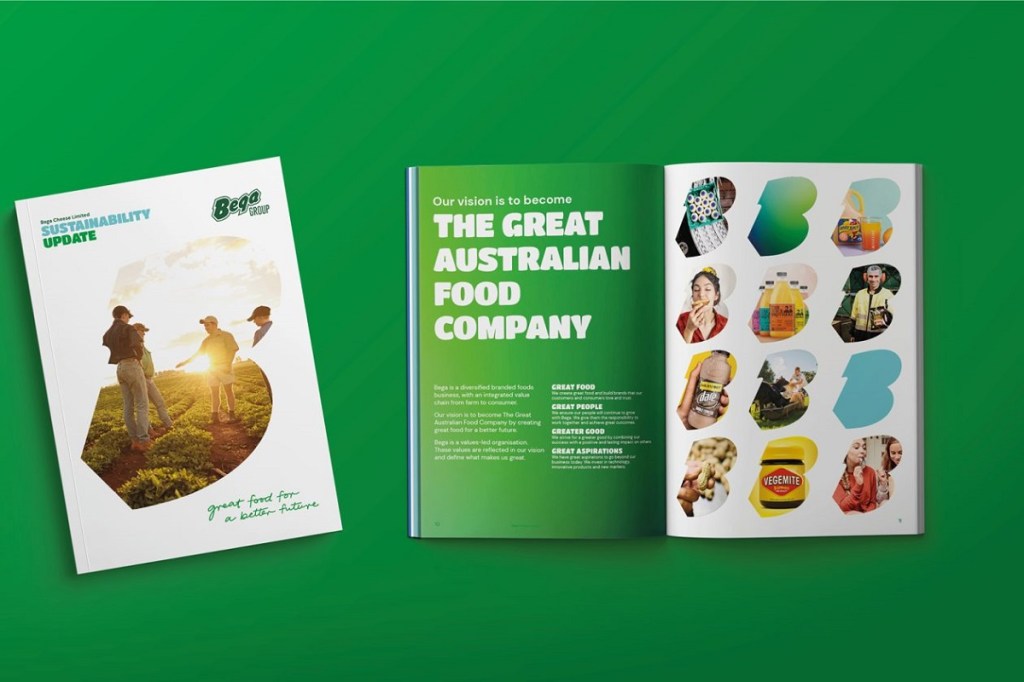
Bega Group has rolled out a new brand identity, changing the corporate brand from red to green, to signify its shift from cheese to a multi-category business.
The new brand identity is said to better reflect their business transformation ambitions, purpose-led initiatives, and what their business units stand for today. Existing products such as cheese and Bega peanut butter will continue with the red logo.
Paul van Heerwarden, CEO of Bega Group, said it was important to represent the Bega group of today following recent acquisitions, including the 2021 acquisition of Lion’s Dairy and Drinks Portfolio.
“It was important that we represent the Bega Group of today and how we continue to serve all Australians with great food for a better future. Working closely with Amber and the team at the Edison Agency, they were able to capture this in the new design that we are very proud of.”
Australian design consultancy, The Edison Agency, developed the strategy and new brand identity to capture the social purpose and humility sitting at the heart of the Bega Group culture.
Amber Bonney, Founder and Head of Strategy at The Edison Agency, said their role in the project was to gather the insights and create a blueprint for change that was iterative and engaged key functions of the businesses to create a collaborative brand solution that reflected the needs of their people.
“The visual identity evolved from of the business’s commitment to growth and humility – in separating the corporate brand from the product (particularly cheese) brand we are able to reflect the true scale of the group across their foodservice, nutritional’s and ingredients, dairy and drinks and foods portfolios. As a purpose-led business ourselves, we are proud to have been trusted with such an important junction in time for this Aussie success story.”
The evolved brandmark is said to reflect the business’s authentic connection to its home in the Bega Valley, and important part of the business’s iconic history as one of Australia’s oldest dairy producers.
Included in the rebrand is a comprehensive new print and digital design system including a bespoke purpose signature, dynamic new colour palette, photography image bank, infographic library, wayfinding, truck livery, and marketing collateral templates.
Darryn Wallace, Executive General Manager, Dairy and Drinks, at Bega Group, said the new brand language is a symbol of their commitment to transformation through social impact.
“Historically, our corporate profile has been intrinsically linked to our cheese brands but now we have the opportunity to celebrate so much more – great brands, an innovative culture, commitment to our people, farming community and partners. One of the most important attributes of the new corporate design is the creation of a bespoke signature to bring our purpose of ‘Creating great food for a better future’ to life as the hallmark rally cry. We are proud of the new design– it’s fresh, dynamic and warm and sets the business up for an exciting next chapter of growth.”
To stay up to date on the latest industry headlines, sign up to the C&I e-newsletter.

