You may have noticed C&I looks a little different, and you’re not wrong; the title has undergone a redesign.
Just as it is important to occasionally reset the aisles in a convenience store, it is important for a magazine to maintain a refreshed and inviting feel. While the content hasn’t changed, the look of the title has been updated to better reflect the ever-changing convenience and impulse retailing landscape.
Safa de Valois, Group Publisher of C&I Media, said the time felt right to change things up.
“As the industry changes, so must we. The redesign offers a fresh new take on C&I, while at the same time maintaining the elements that readers know and love about the title.
“The importance of effective communication and engagement cannot be overstated, and this redesign will offer readers a splash of fun while still dishing up the quality content they’ve enjoyed over the years.
“I’d like to thank our whole team for putting this together, they’ve really done a tremendous job, and we hope that you get as much enjoyment from the new design as we all did from creating it.”
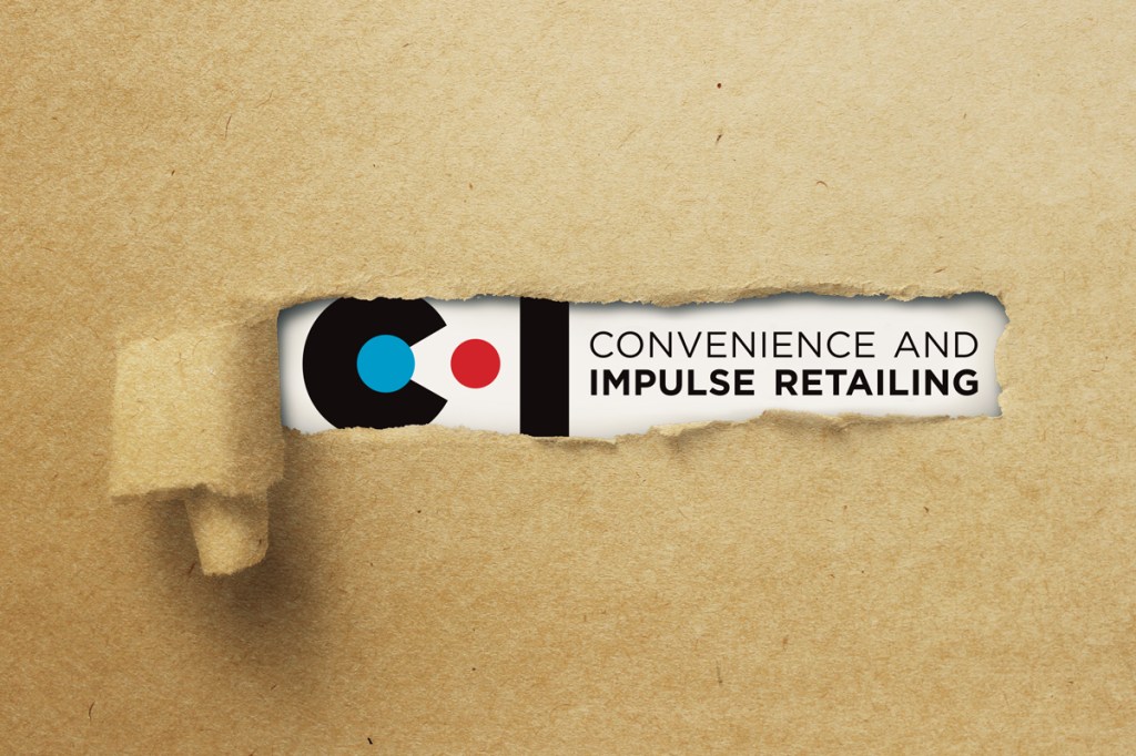
Alyssa Coundouris, Art Director at C&I, said the logo redesign is intended to reflect the moment when a consumer prepares to pay for their selected items at the retail counter.
“The distinctive red and blue colours, synonymous with C&I, have been repurposed in the new design because they provide a visual connection to the history of the brand.”
The new design will be evident across all elements of C&I, from the magazine to the website to social media and the newsletter.
To stay up to date on the latest industry headlines, sign up to the C&I e-newsletter.