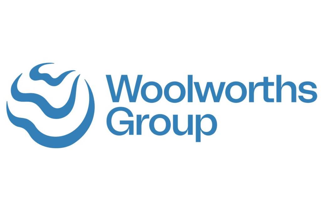
Woolworths Group has introduced a new brand identity to better symbolise its evolution and what its collective brands stand for.
The new symbol features three blue fluid wave-like ‘W’s, which Andrew Hicks, Woolworths Group Chief Marketing Officer, says captures the spirit of agility and adaptability whilst deliberately being an open shape to signal an expansive mindset welcoming partnership.
“With a living blue colour scheme, our collective impact is also symbolised by the waves and ripples, converging on a common point on the horizon as a reminder of our shared commitment as a Group to a better tomorrow.”
Brad Banducci, Woolworths Group CEO, said the world is constantly changing and evolving and they need to do the same.
“The last two years have been a period of immense change. As a team we’ve not only had to navigate a pandemic, but we’ve also made significant changes to the shape of our Group and the businesses and platforms within it.
“It’s been an era of care for people, as well as partnership, innovation, inclusion and sustainability and being connected by a shared purpose has never been more important.”
The new brand and system were developed in partnership with Re, part of creative agency M&C Saactchi Group.
Banducci said the new identity is a symbol of the positive impact that the company aspires to have the purpose that unites it.
“It’s only by working together as a Group, across all our businesses and platforms, and in partnership with others, that we will be able to help to create a better tomorrow.”

